Concept Project / 2014
Vaik
Design for a urban transportation company
A bold visual identity for an urban bicycle company, built around vibrant colors, sharp geometric forms, and a dynamic graphic language that captures the energy and movement of urban mobility.
Overview
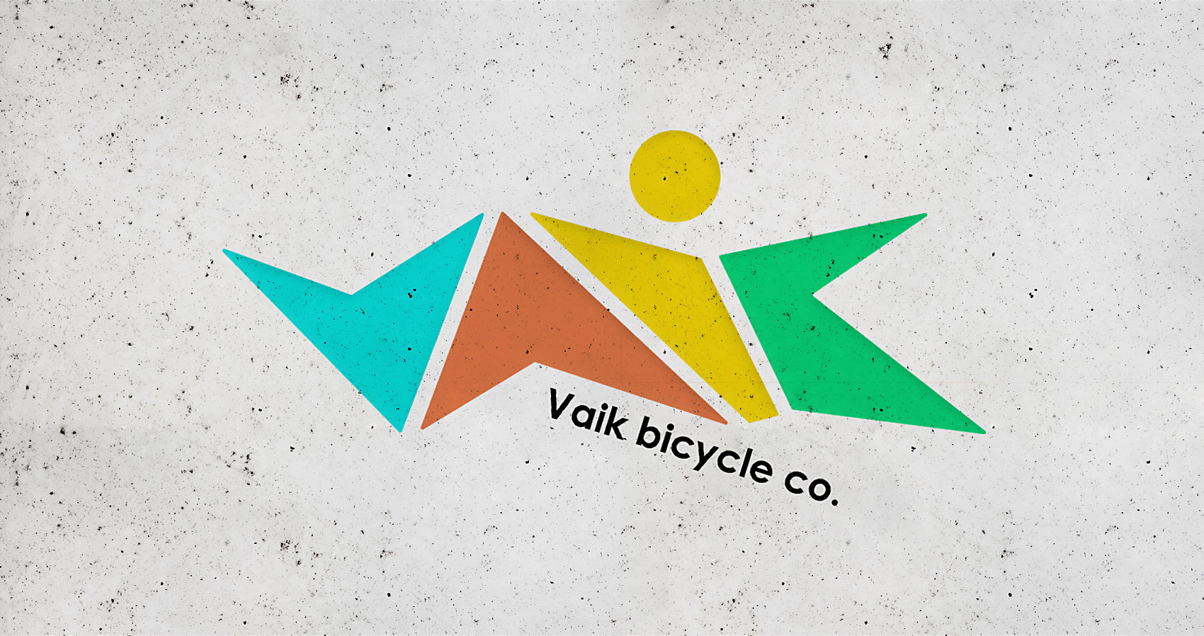
The project focused on developing the visual identity for an urban transportation company specializing in bicycles. The goal was to create a distinctive brand language that communicated an active lifestyle, urban energy, and a dynamic approach to mobility.
The Challenge
The main challenge was to translate the energy and dynamism of urban cycling into a recognizable visual identity. The brand needed to stand out while expressing movement, confidence, and an active lifestyle through a consistent visual system.
The Solution
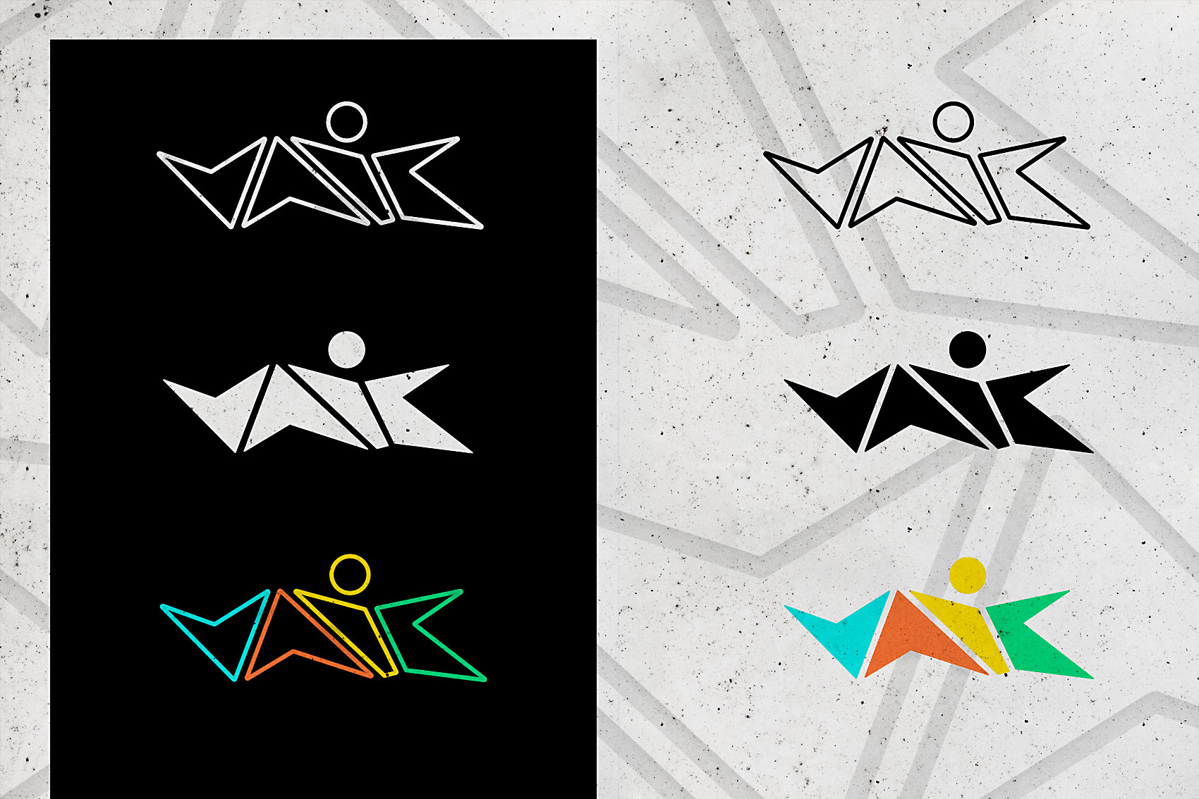
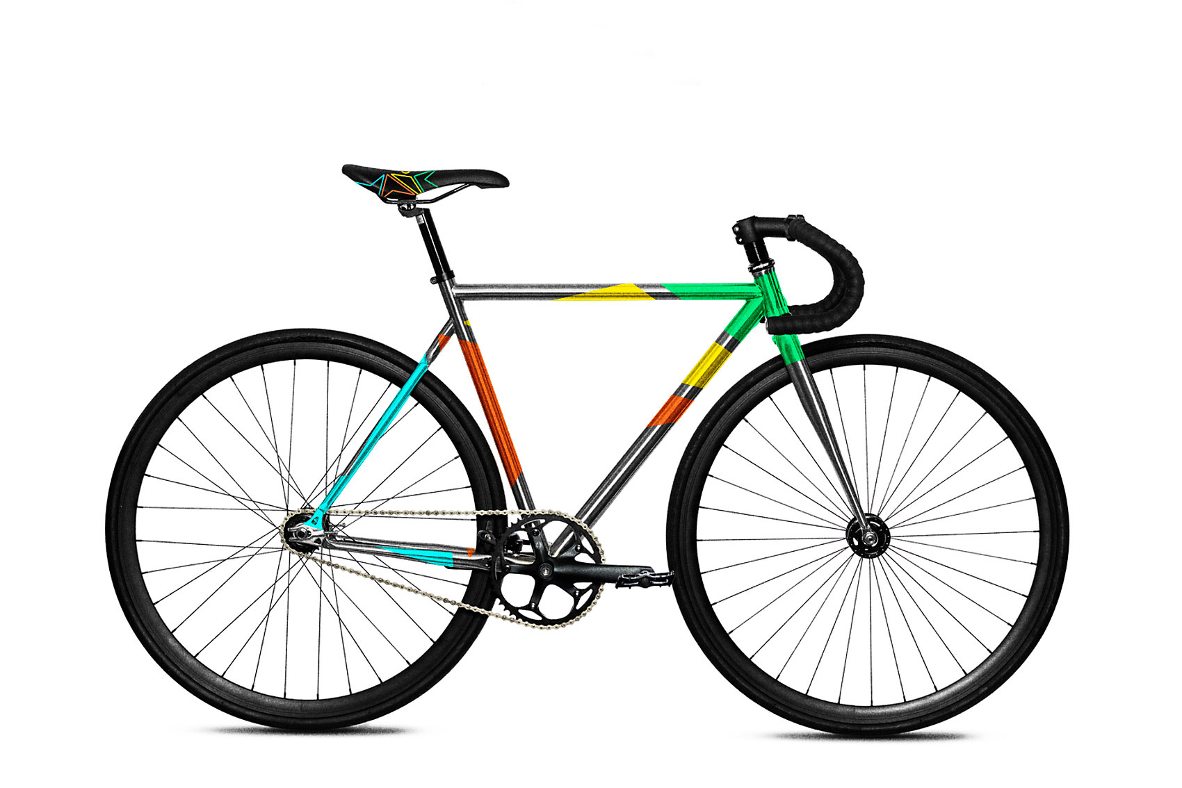
I created a vibrant visual language built around a neon-inspired color palette, balanced by deep blacks and white to establish strong contrast. Sharp geometric shapes and angular compositions introduced a sense of movement, speed, and edginess.
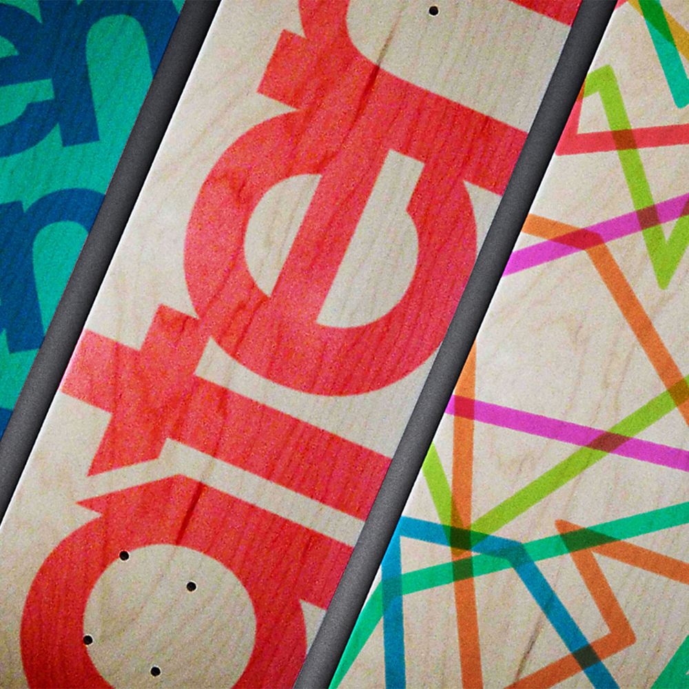
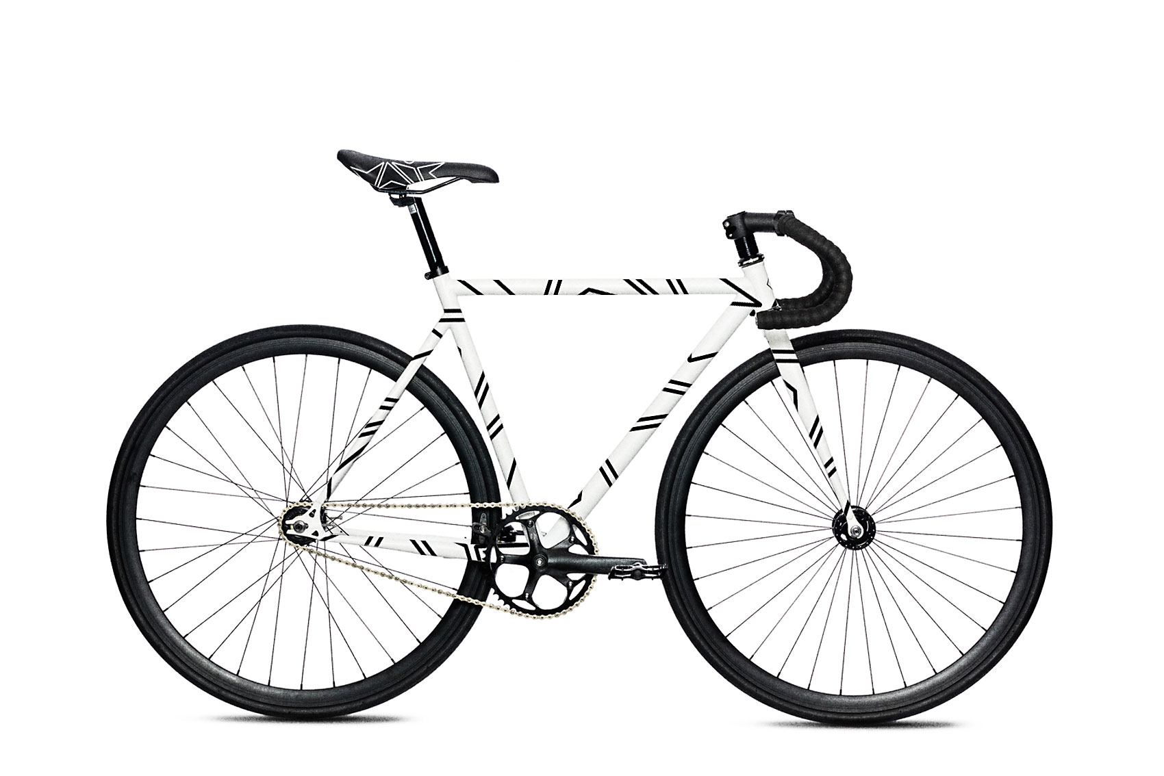
Visual language applied to the products
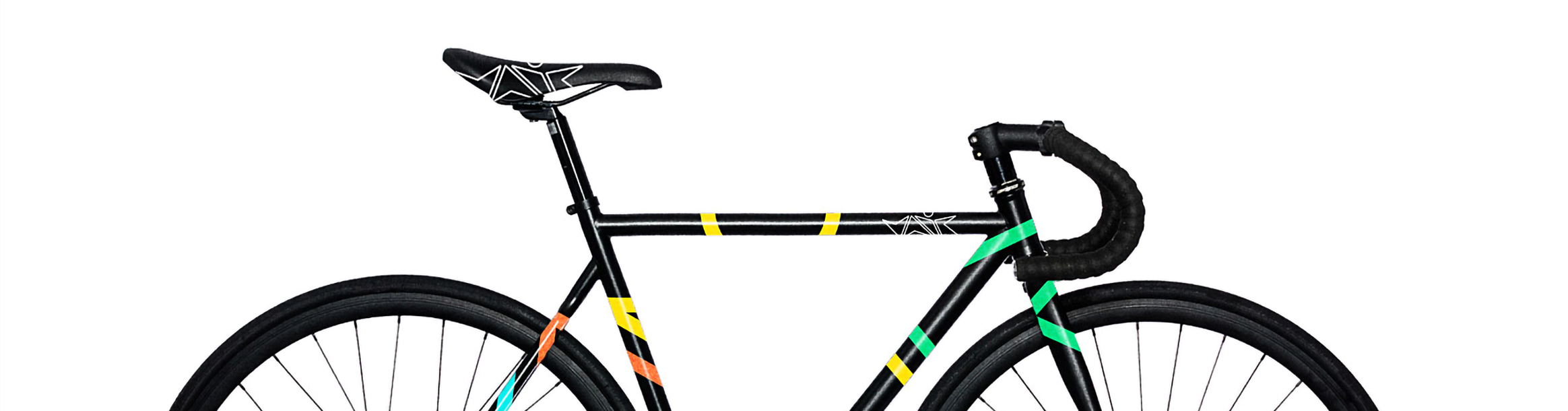
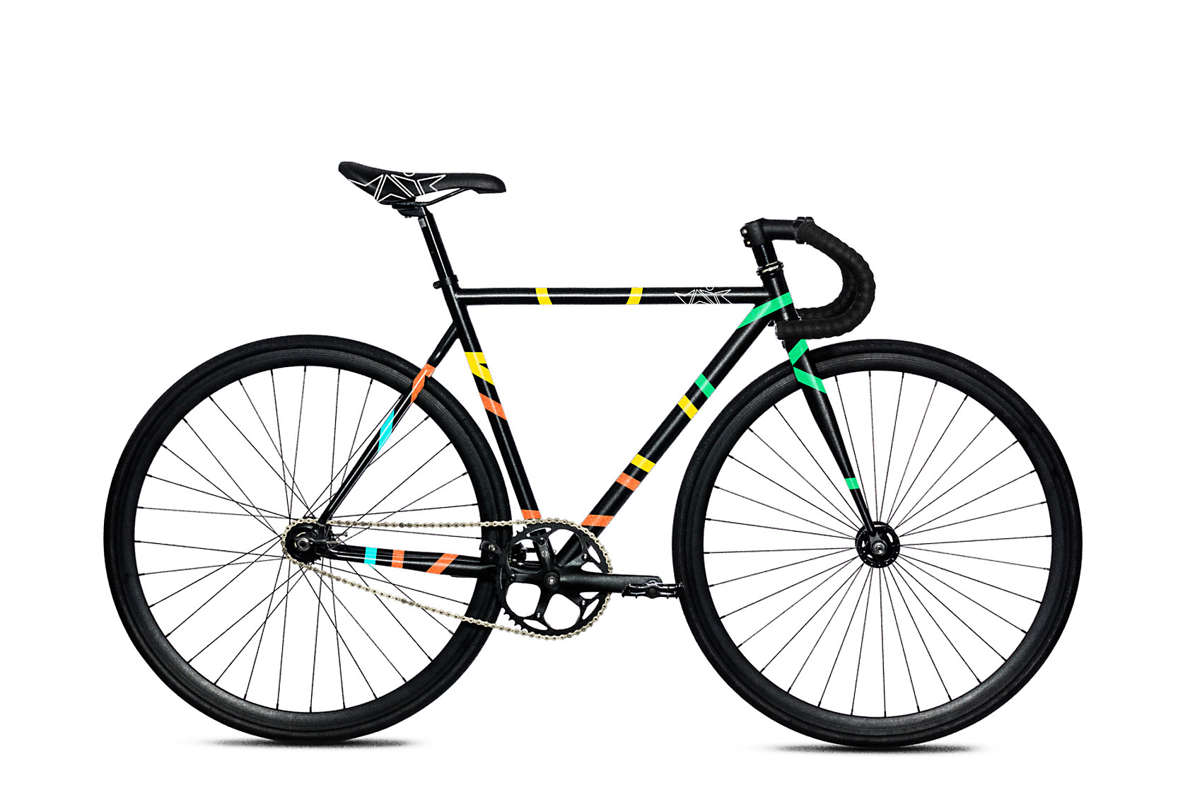
I applied the identity to the products to exemplify how distinctive the product aesthetic can be. The combination of sharp shapes, high-contrast tones, and dynamic compositions reinforces the brand’s energetic character while giving the products a recognizable identity.
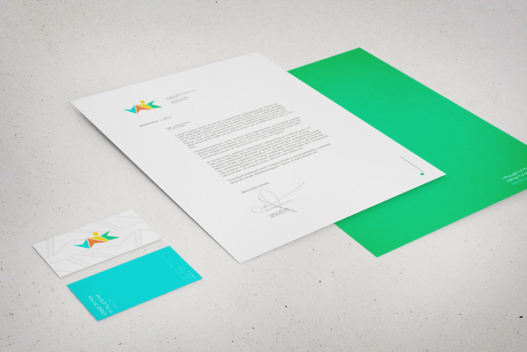
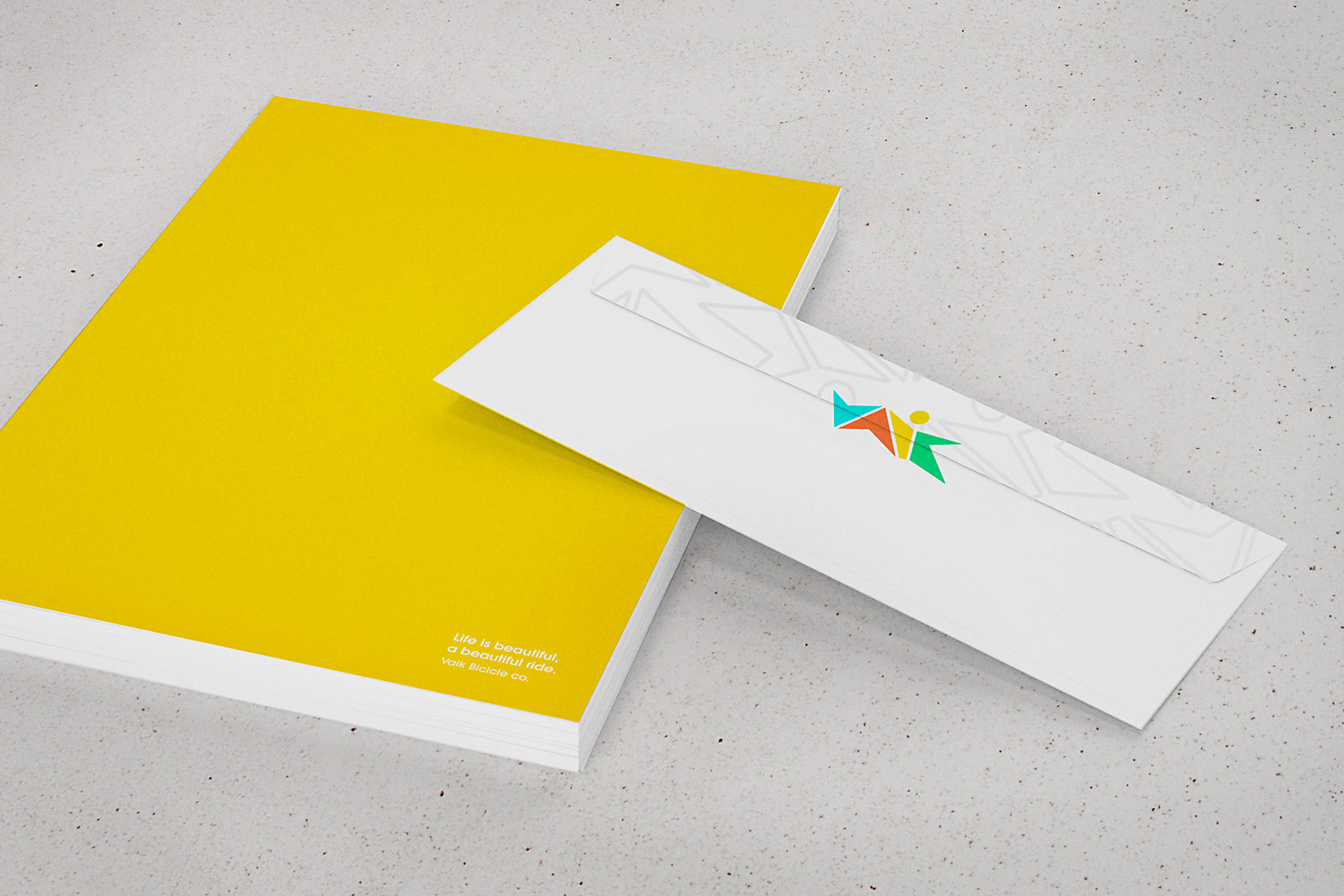
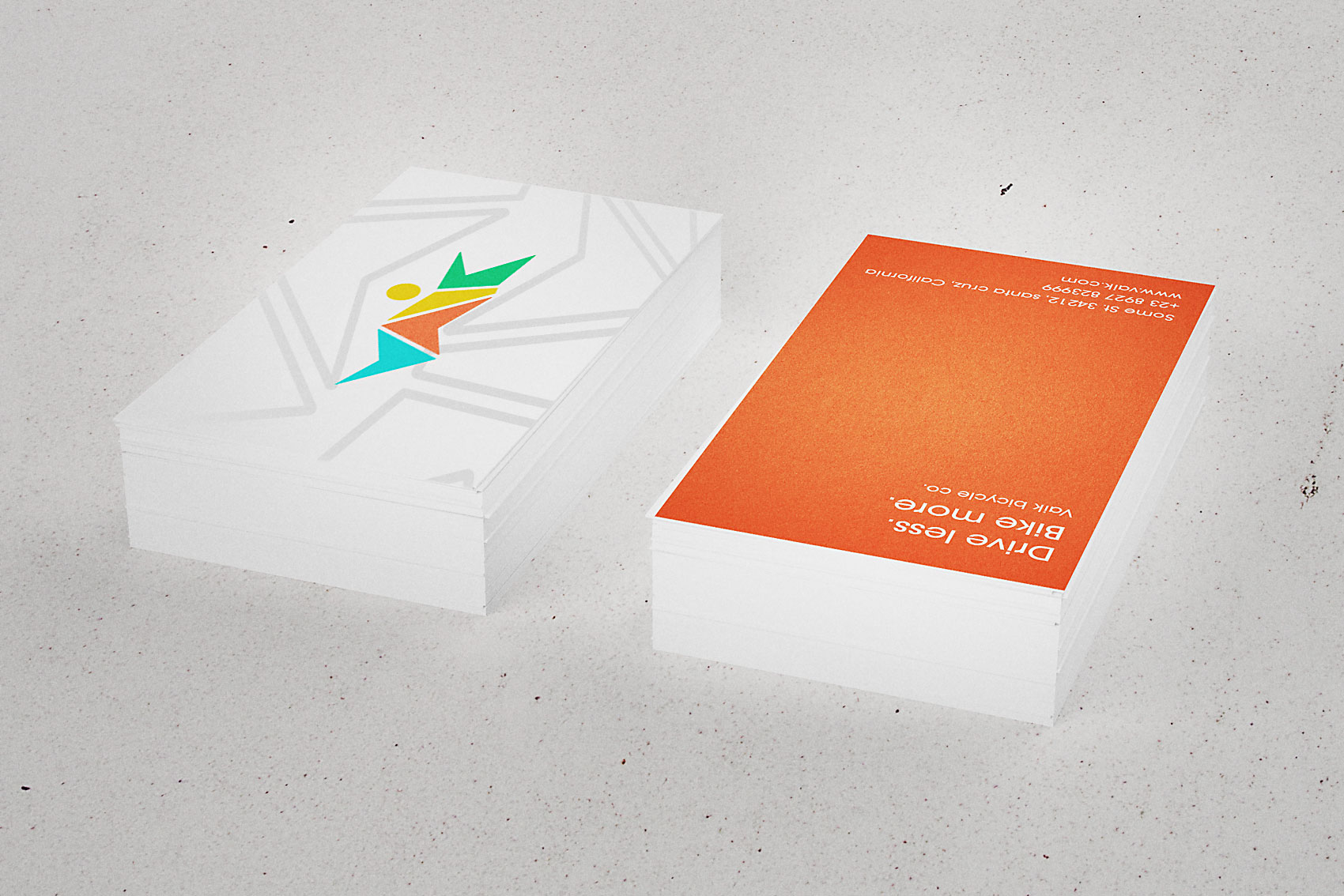
Visual language on the company’s corporate materials
The identity was applied consistently across the company’s touchpoints, including office materials, business cards, envelopes, and other branded stationery.