Overview
Barcelona the Hub for Digital Social Innovation
Barcelona is one of the most active and pioneering cities in Digital Social Innovation (DSI), hosting a wide range of initiatives, companies, and projects that use technology to improve society. These efforts include circular economy models, open data management and usage, free and open-source software, new production and consumption methods, and even food innovation, among many other areas.
The Challenge
Design the Visual Identity for the Initiative.
To create a dynamic, modern, visual identity for DSIPLAY, reinforcing its role as an initiative for exchange, innovation, and social impact through technology. The identity has to reflect openness, collaboration, creativity, and experimentation and will be applied to digital and physical assets.
Understanding
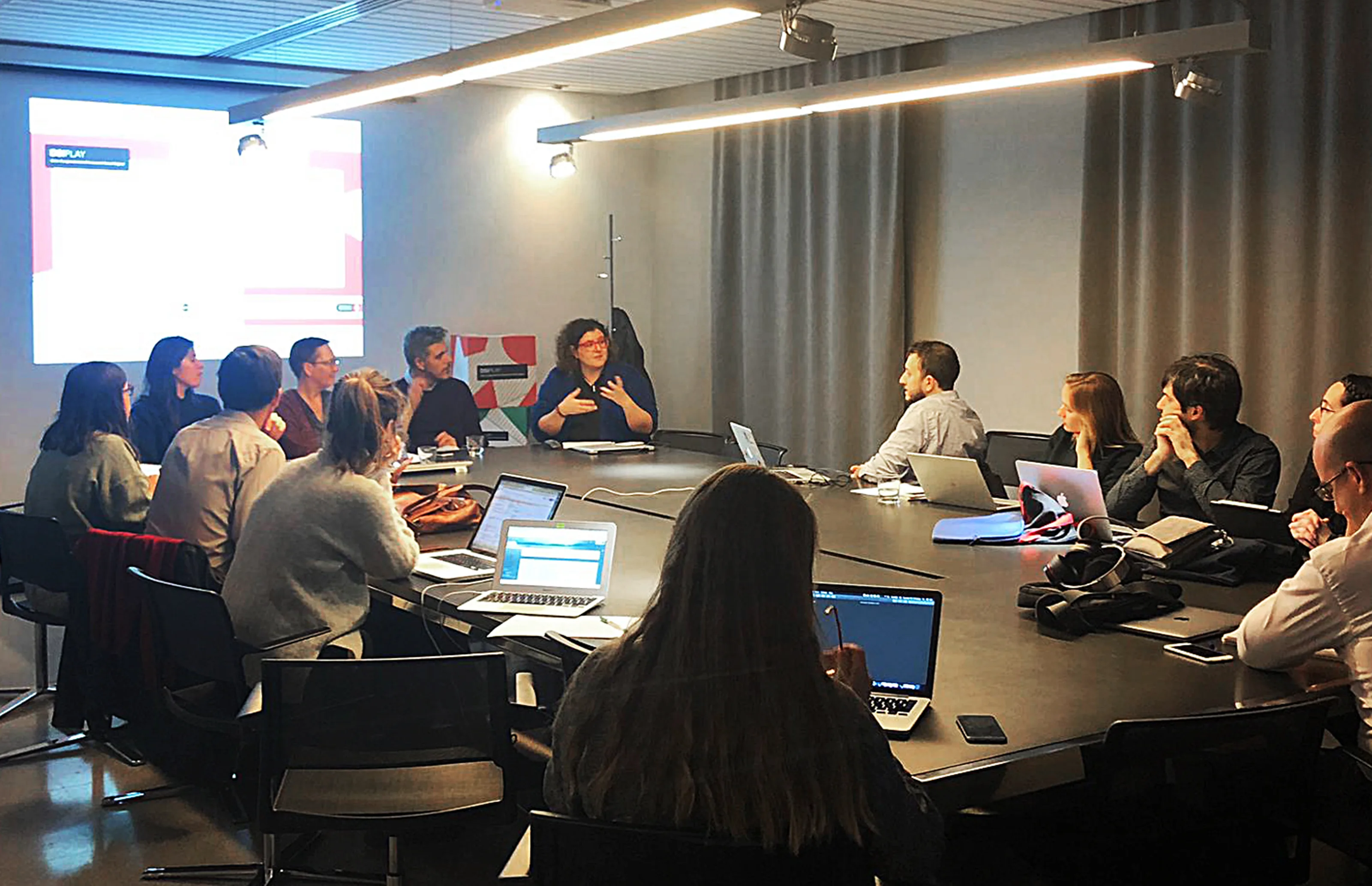
Exploring other DSI projects
I analyzed the visual identities and communication strategies of related Digital Social Innovation projects to identify trends, strengths, and areas for differentiation. This involved studying branding, typography, color schemes, and messaging used by similar initiatives.
Development
Concept & Strategy
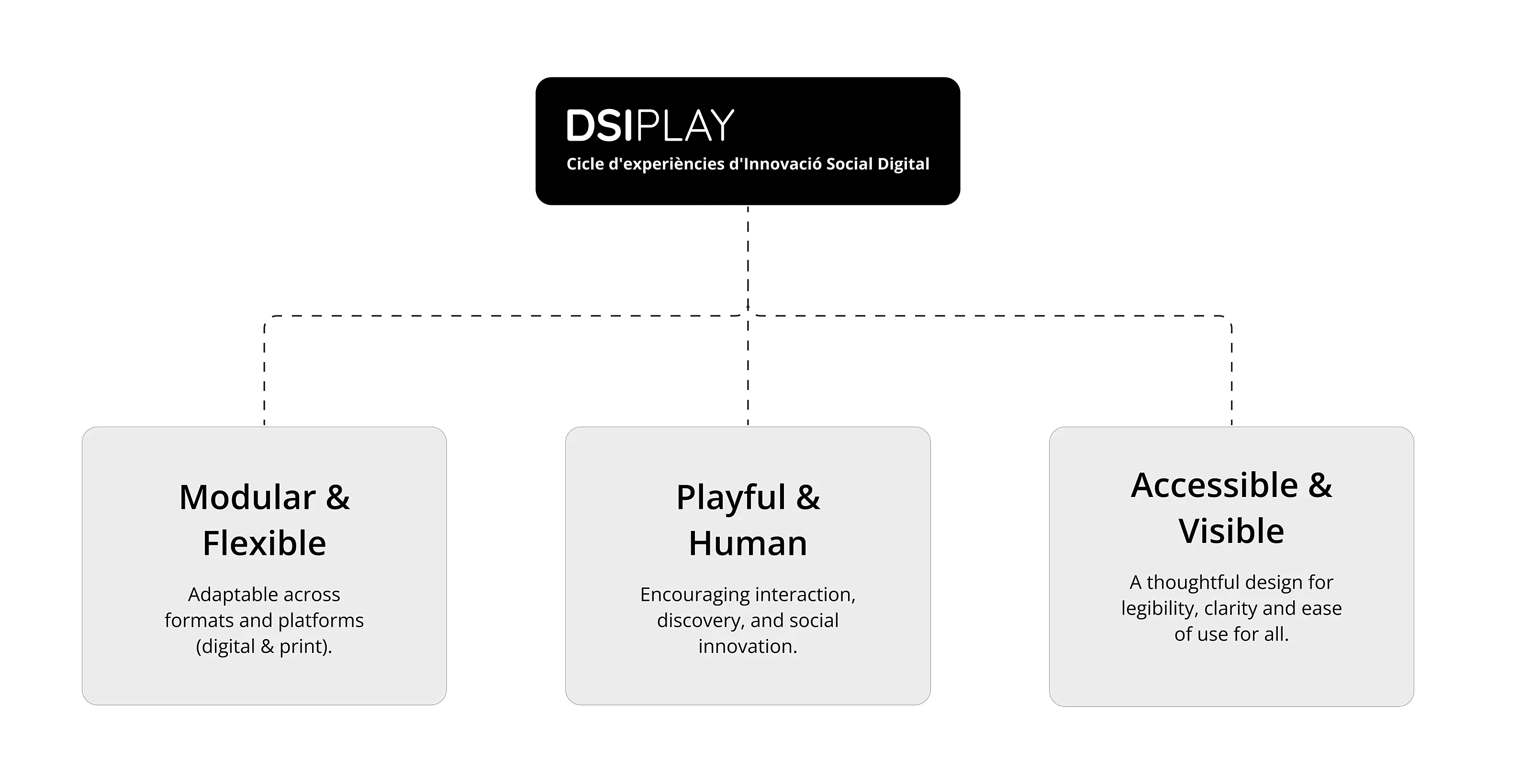
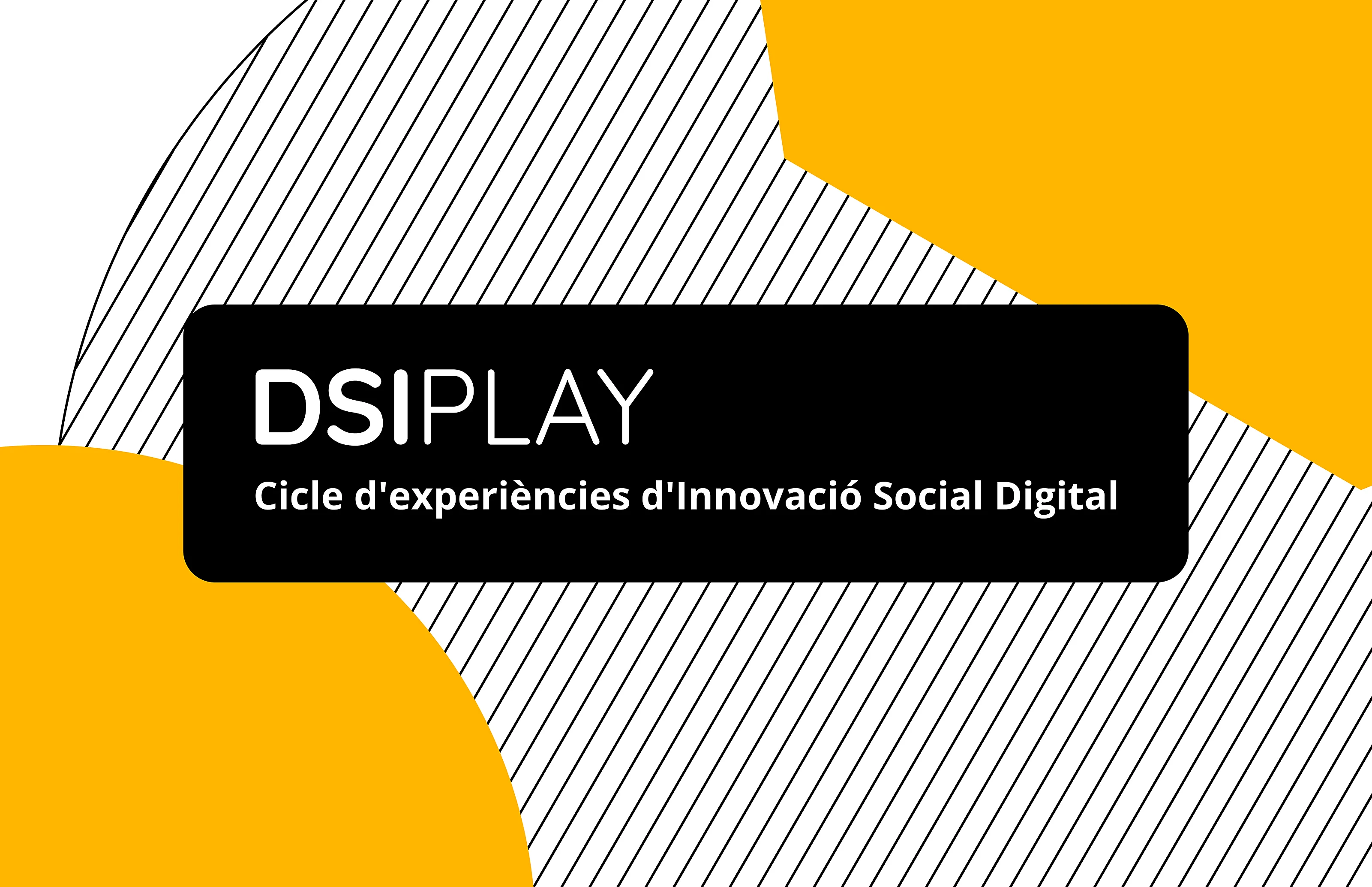
DSIPLAY merges DSI (Digital Social Innovation)—a term used across European networks—with PLAY, representing experimentation and discovery. It also evokes DISPLAY, emphasizing visibility and showcasing innovation.
The visual identity had to amplify this concept supported by three design pillars that ensure adaptability, impact, and inclusivity across all touchpoints.
Logo Development
The DSIPLAY logo is designed with a bold approach, featuring modern typography that enhances accessibility and technological relevance. The wordmark, in its three variations, serves as a dynamic element that adapts across applications, reinforcing versatility, innovation, and modularity.
Logo Variations
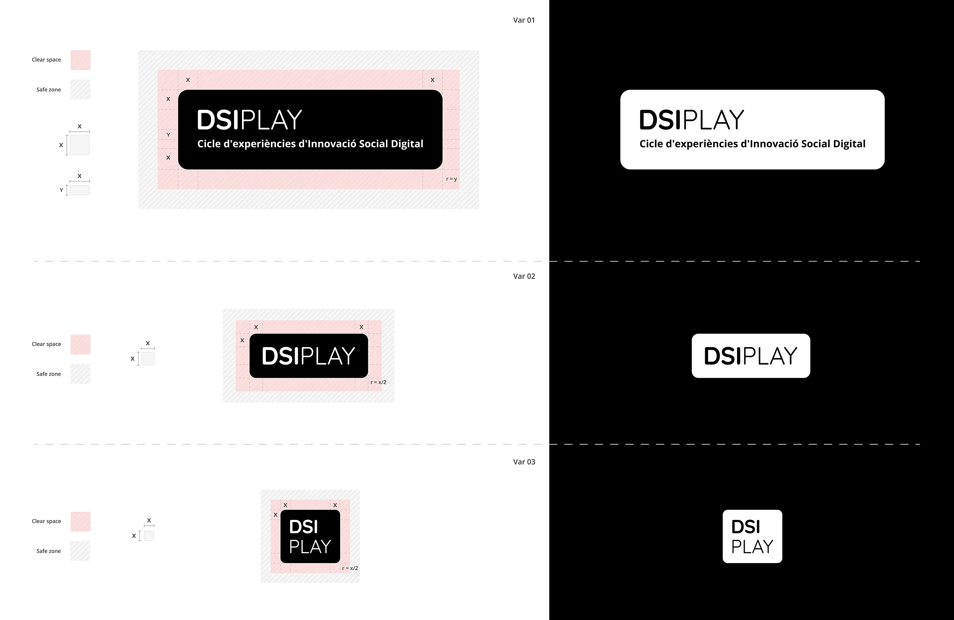
Variations
-
Variation 01: Full size for big to medium applications.
-
Variation 02: Reduced version for small applications or reduced space.
-
Variation 03: Compact version for extra small spaces.
Color Palette
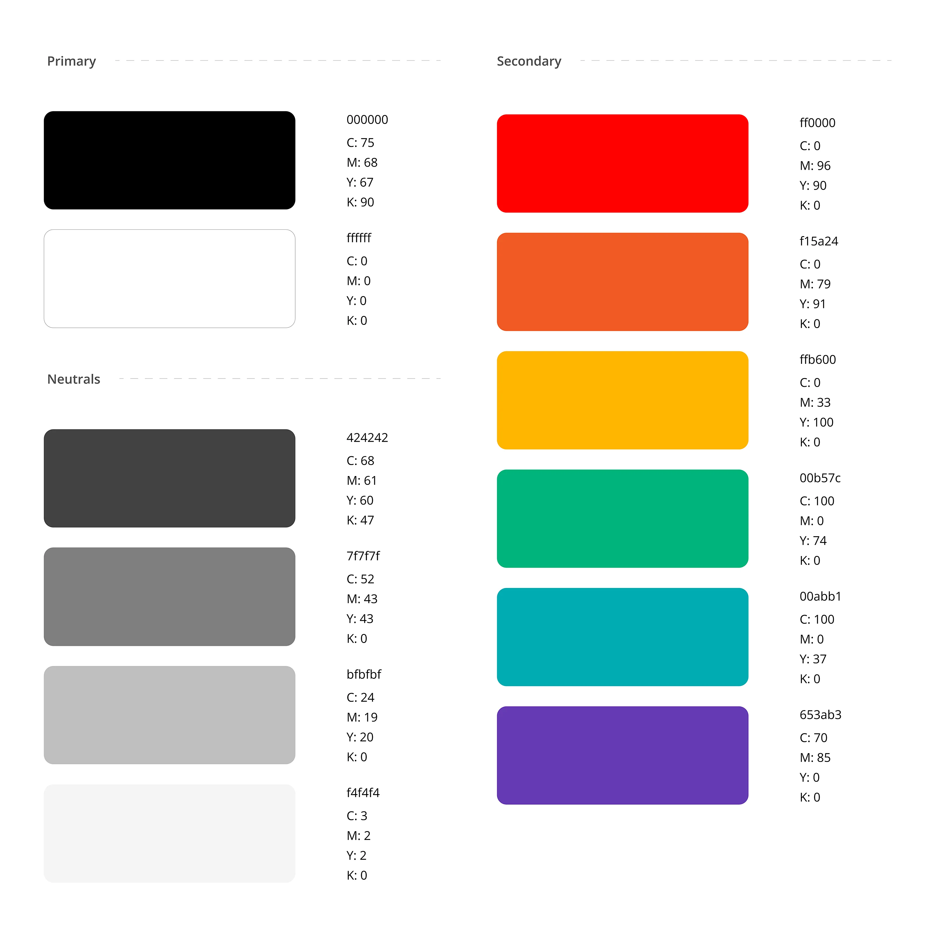
Accessibility Considerations: The palette was tested for high contrast and readability to meet WCAG AA standards.
Typography System
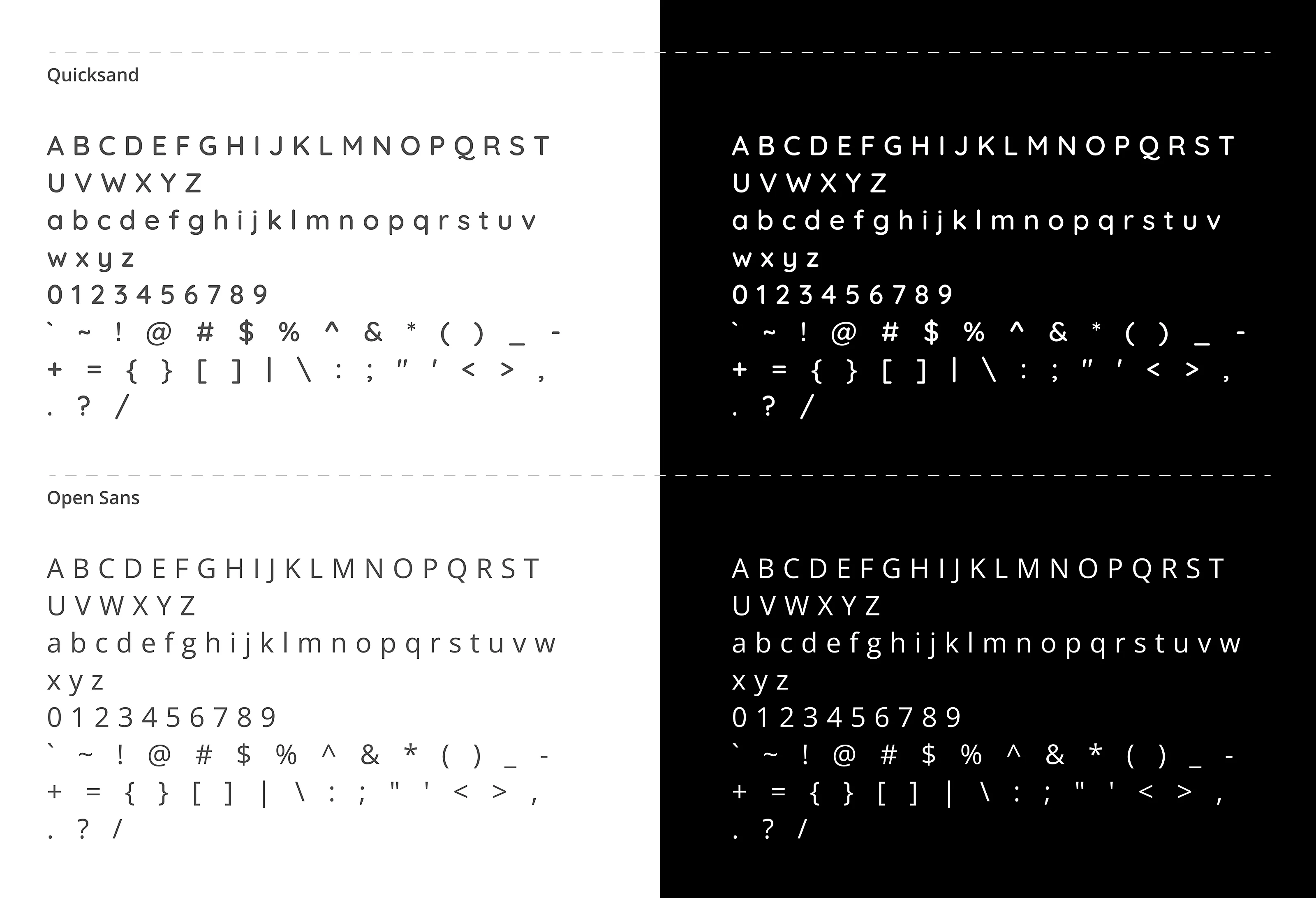
Primary Typeface
Quicksand – A geometric sans-serif typeface with a modern and friendly feel, ideal for digital-first branding.
Secondary Typeface
Open Sans – Chosen for its excellent legibility in printed materials and long-form text, ensuring clarity across various formats.
Visual Elements & Graphic System
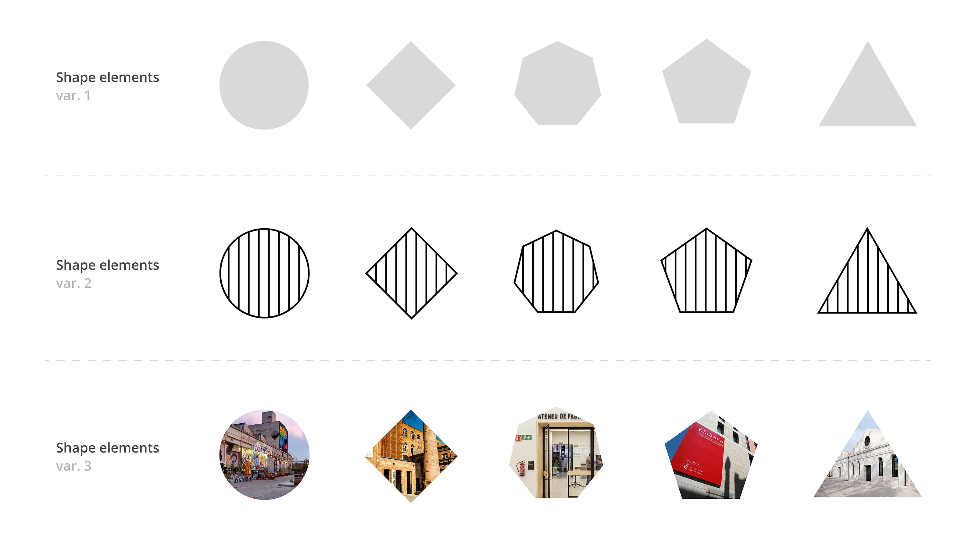
Icons & Illustrations: Geometric icons representing the different ways innovation, knowledge sharing, and digital tools manifestation in the real world.
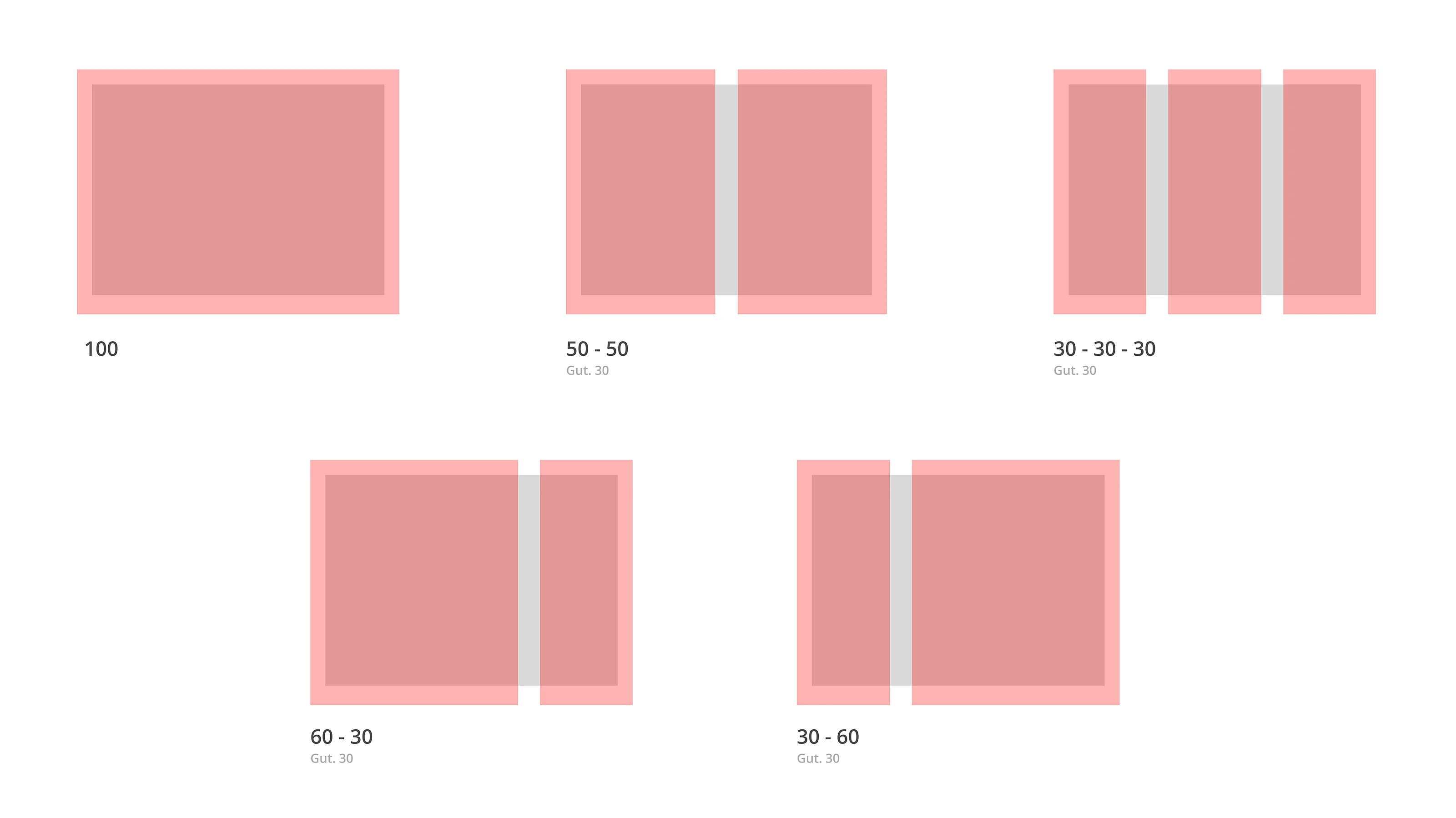
Dynamic Layouts: Symmetric and asymmetrical compositions reflecting information order but with room for graphic playfulness.
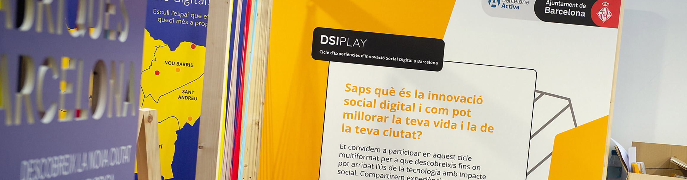
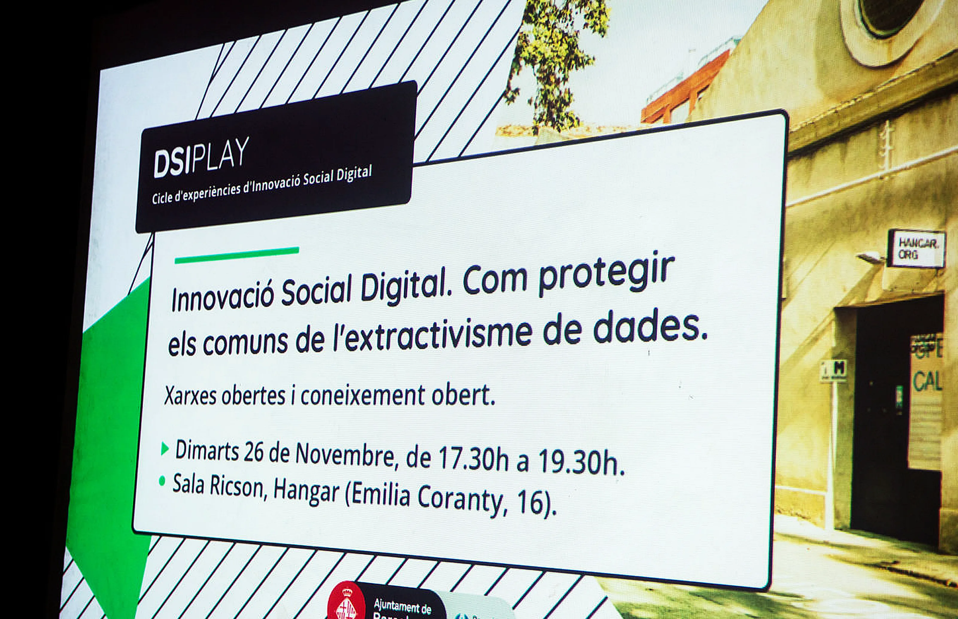
Communication Materials
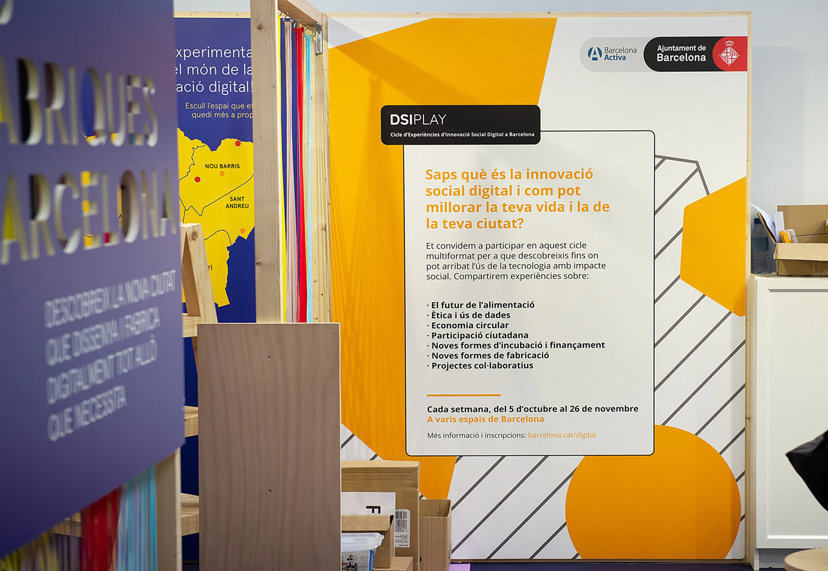
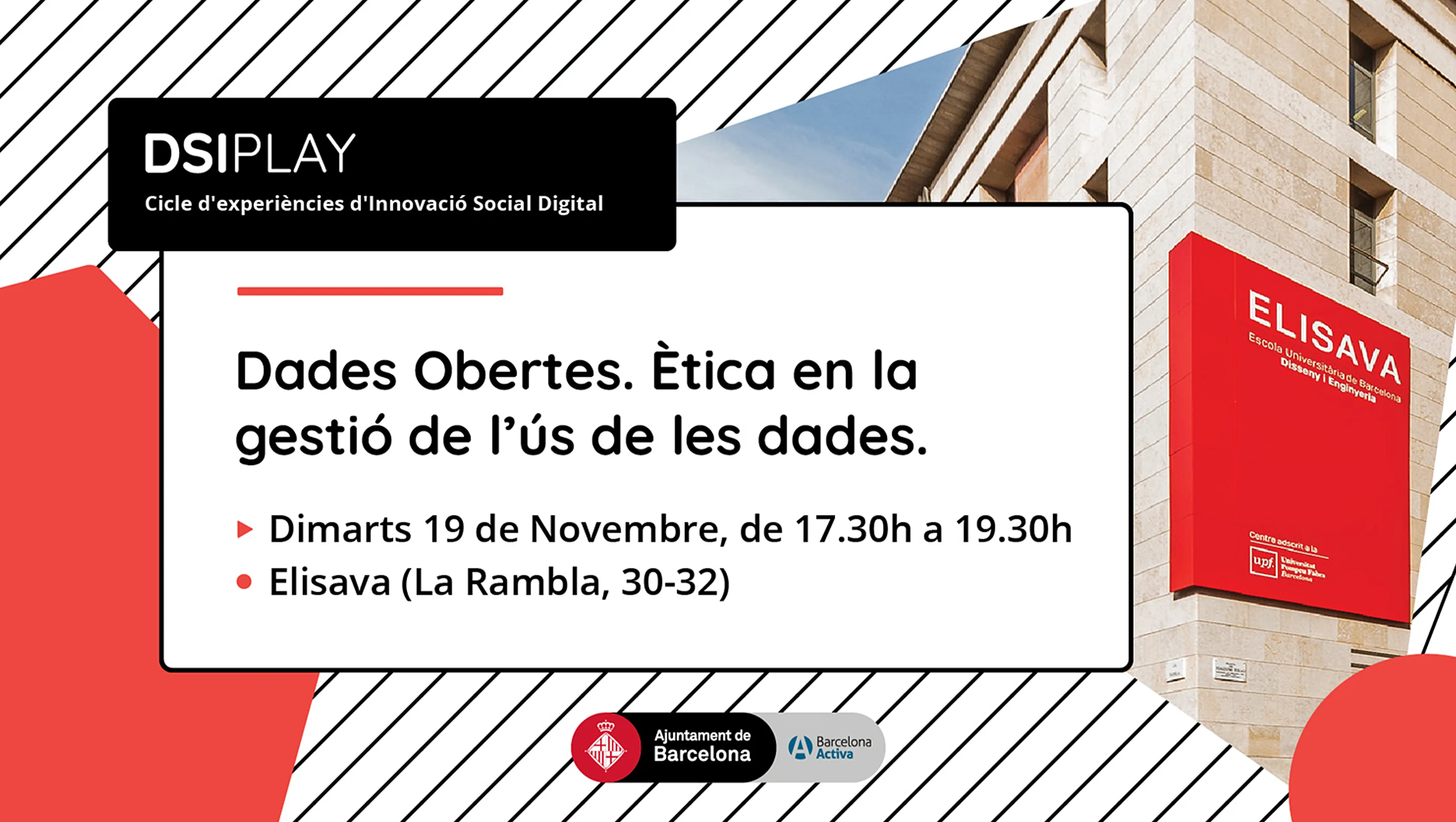
Posters & Banners: Designed for event spaces, featuring bold typography, modular backgrounds, and high-contrast color schemes.
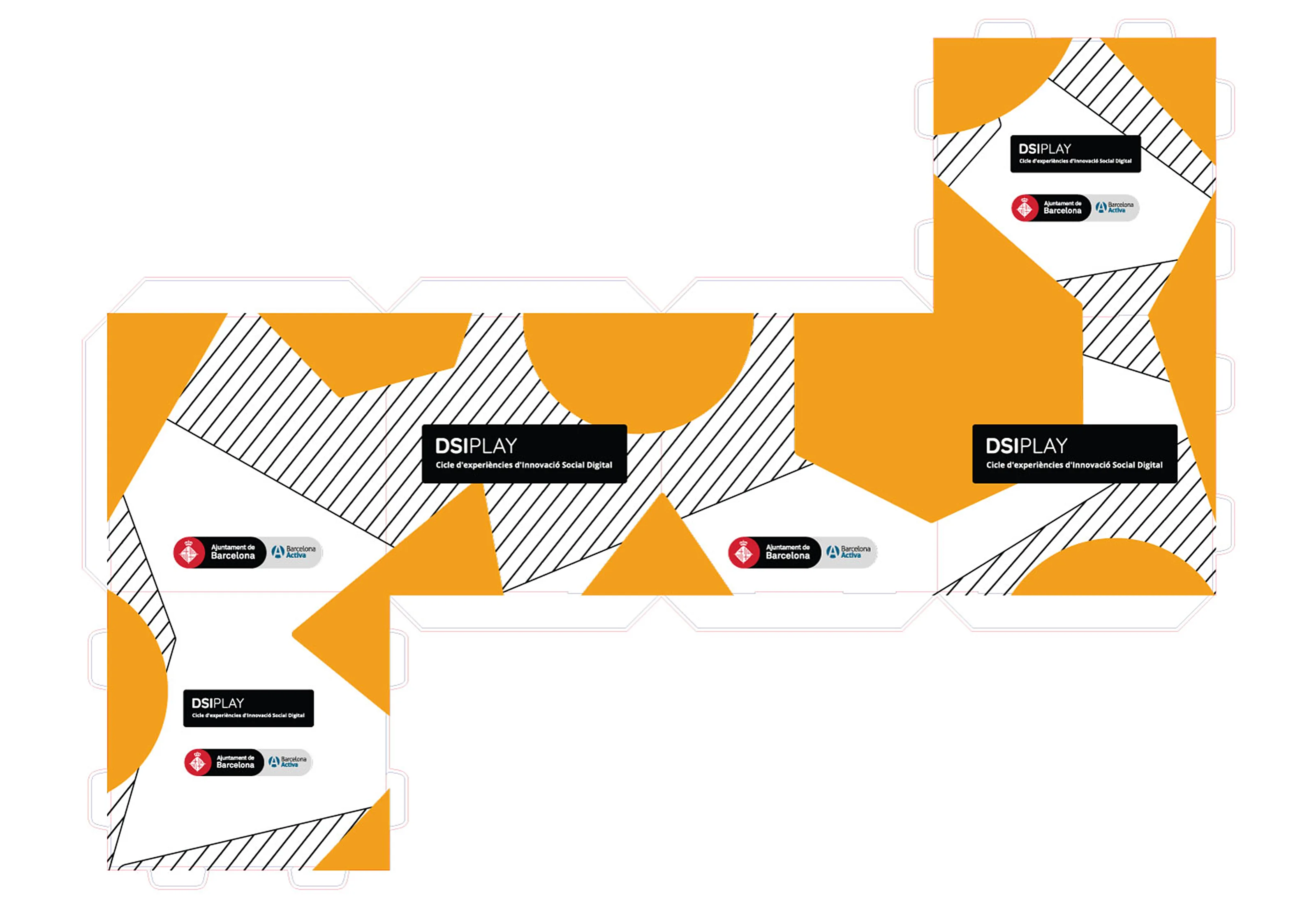
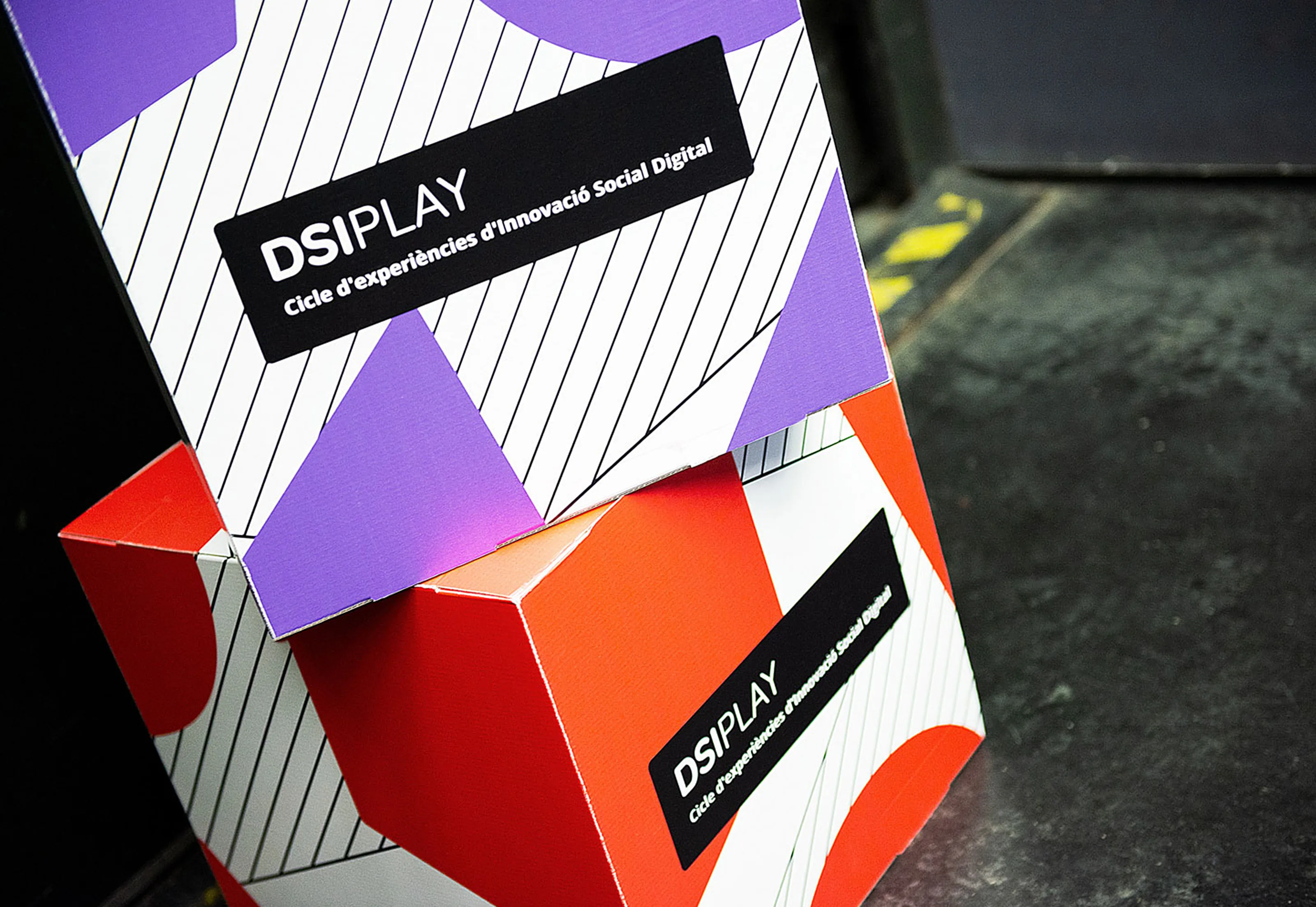
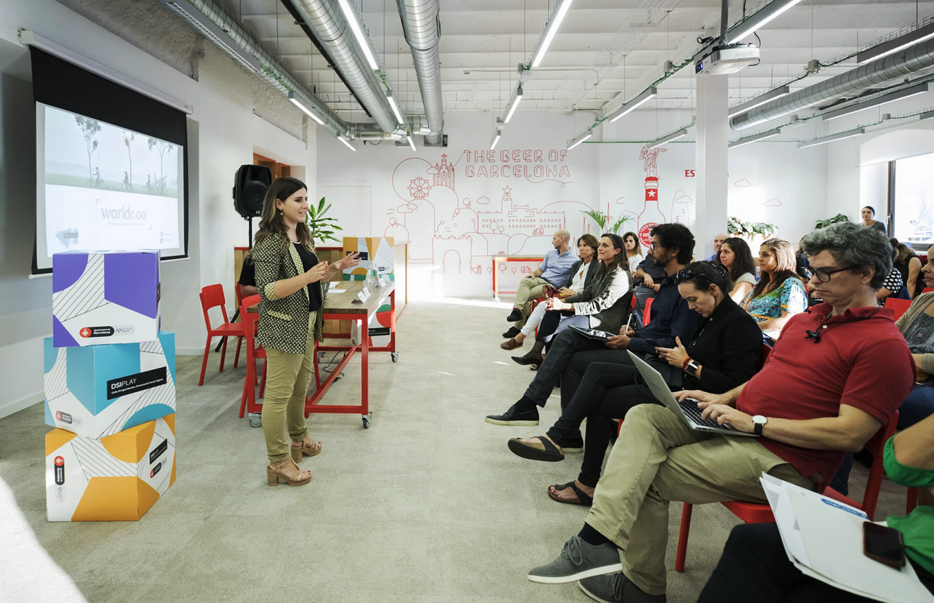
Foldable Cardboard Boxes: Used as physical branding at events, designed with an interactive approach.
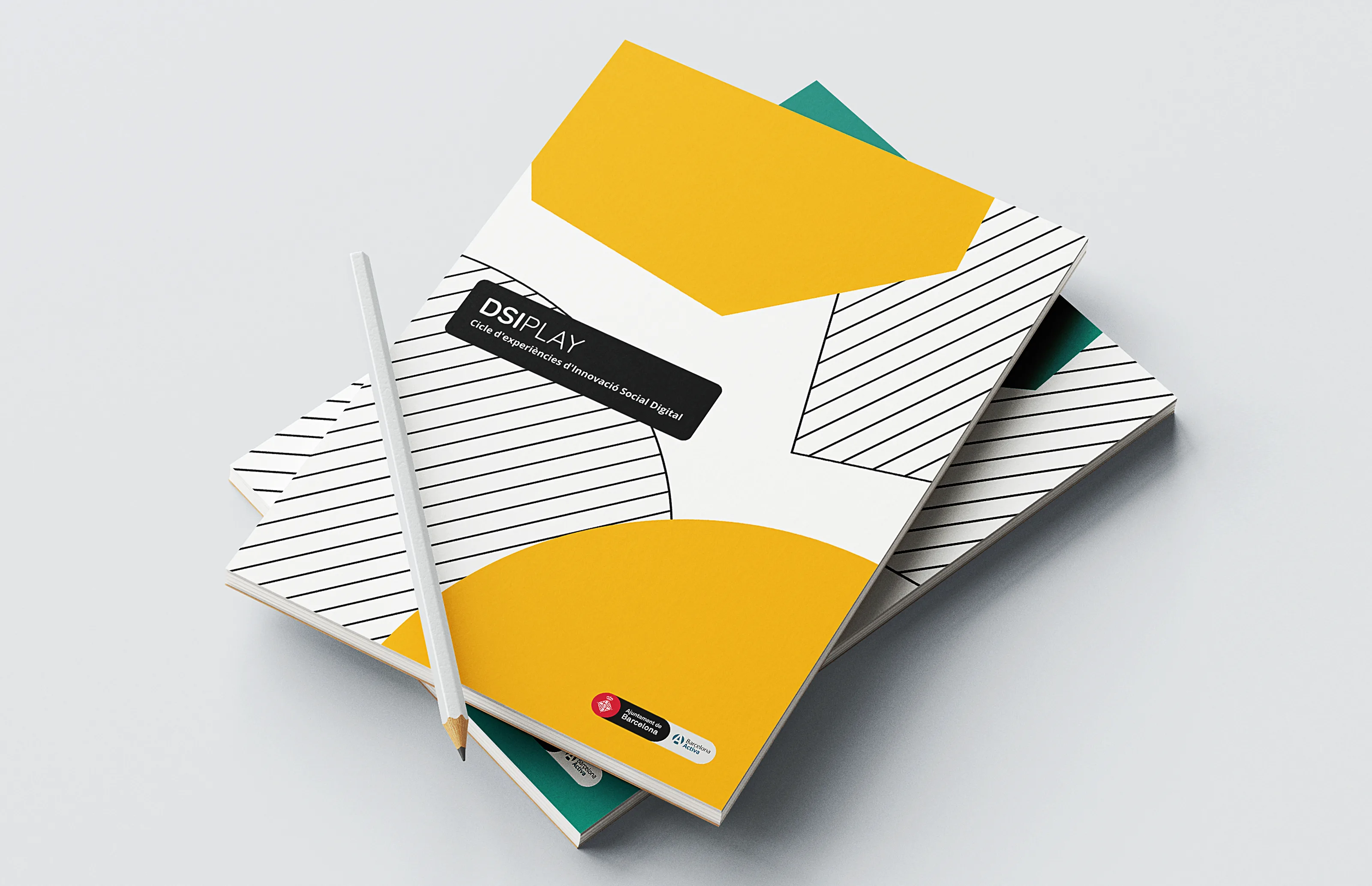
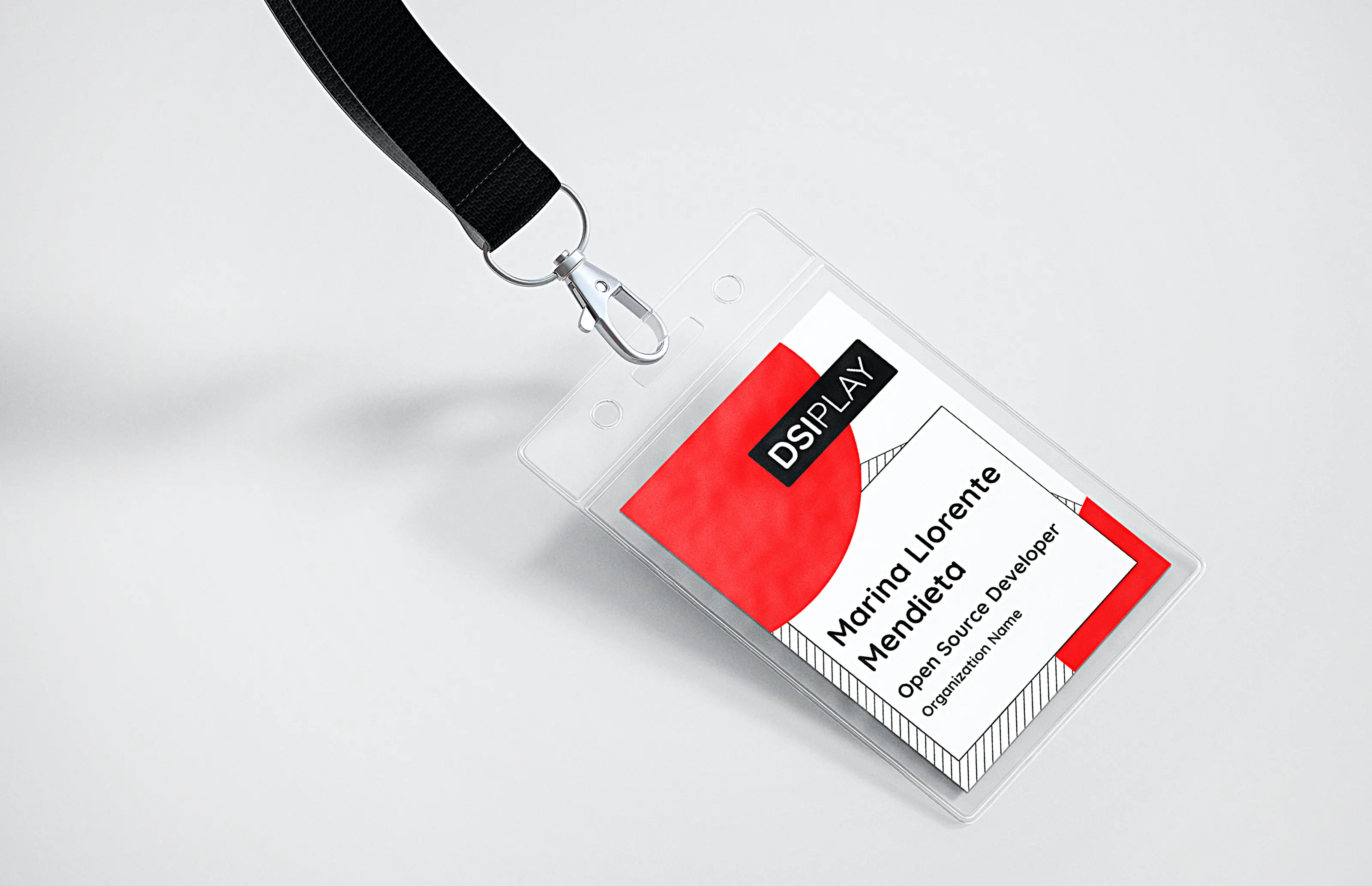
Notepads & Participant tags: Printed materials to support participants during the activities.
Digital Assets
Digital Banners: Web banners integrating dynamic elements from the visual language.
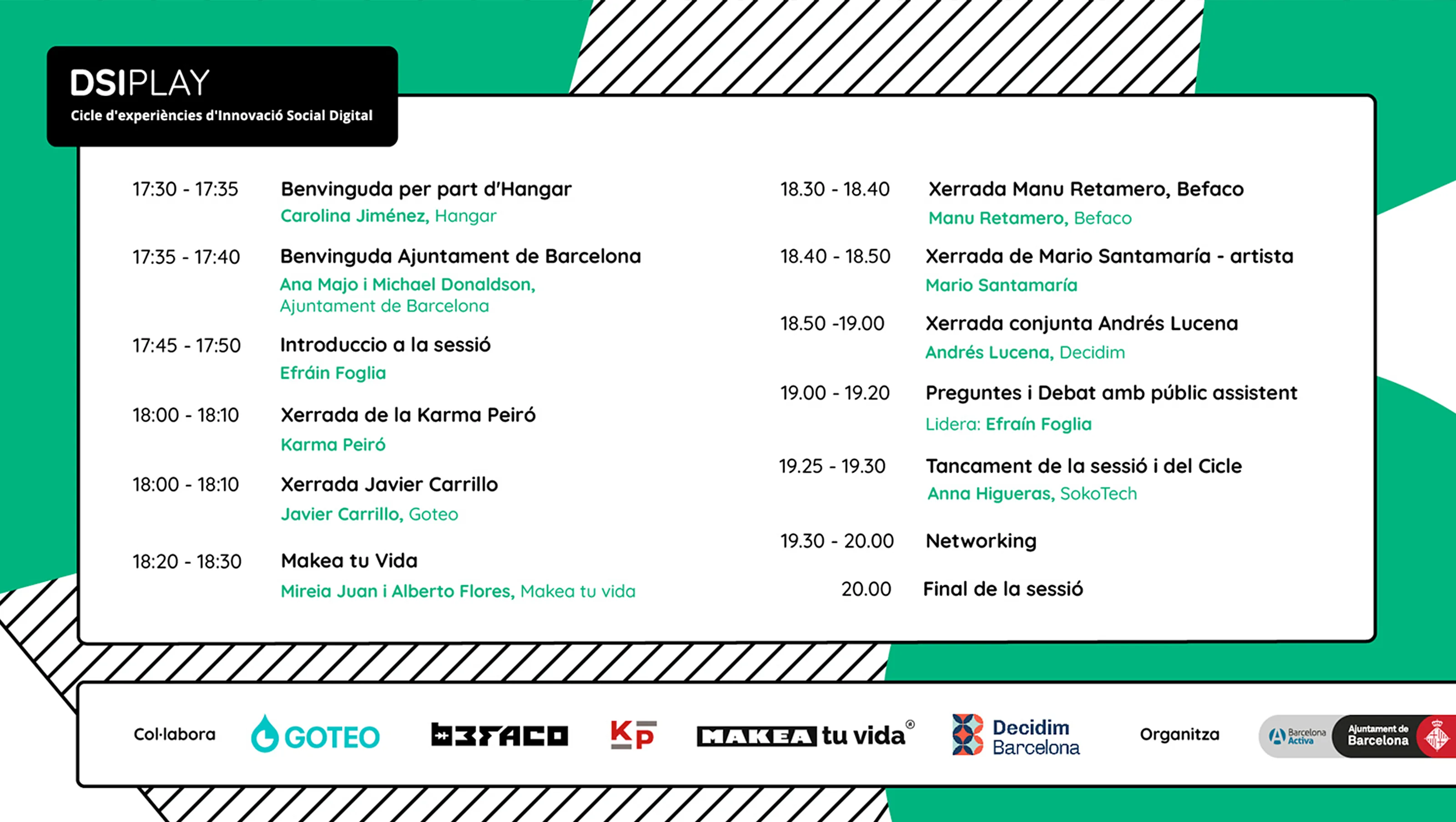
Informative Templates Adaptable informative elements using branded colors and typefaces.
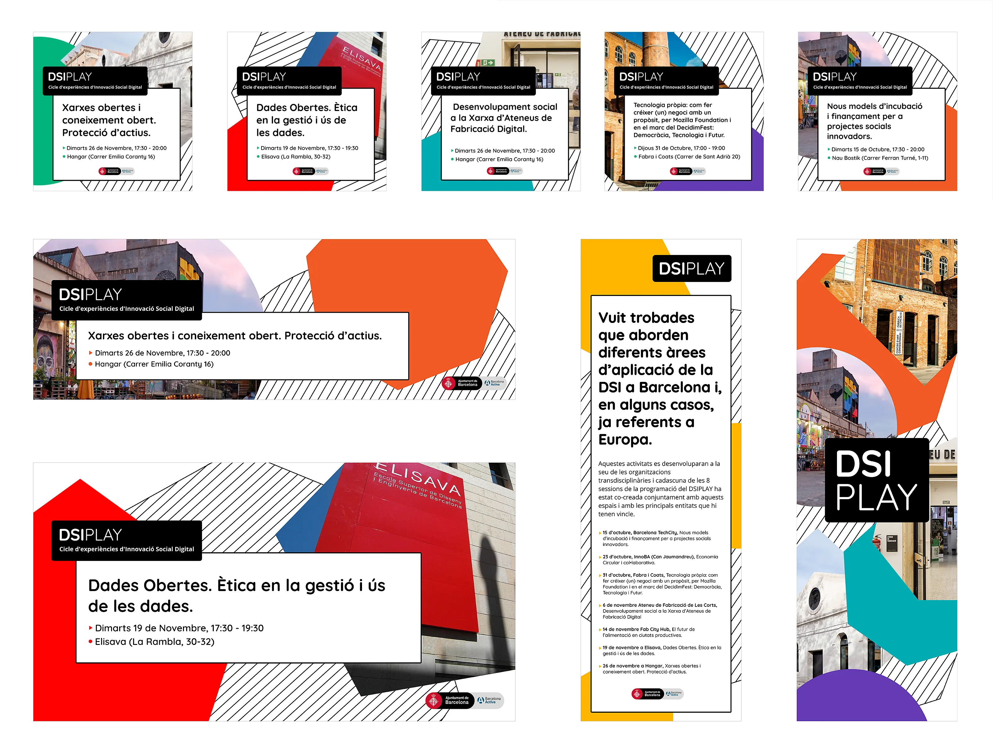
Social Media and Web Templates: Digital communication elements using branded colors and typefaces, optimized for social media platforms.
Implementation Outcome
The DSIPLAY branding successfully translated its core values into a bold, adaptable, and engaging identity, ensuring consistency across both digital and physical platforms.
-
Established a strong and recognizable identity within the Digital Social Innovation community.
-
Created a cohesive visual language that resonated across different mediums.
-
Ensured scalability and adaptability, making the identity future-proof.